Excel Tip – The NETWORKDAYS function

Work Days

From the Not Just Numbers blog:

Before we get into today’s post, just a little reminder that tomorrow (31st July) is your last chance to get the 20% discount on Mynda Treacy’s Excel Dashboards course. Also, don’t forget I’ll be sending an absolutely free copy of my Introduction to Pivot Tables course to everyone who signs up to Mynda’s course.

This week’s post is a quick one on a useful function that allows you to calculate the total number of work days between two dates. This is particularly useful for budgeting, where production (or sales) is driven by the number of working days in each period.

The syntax of the NETWORKDAYS function is as follows:

=NETWORKDAYS(Start date,End date,Holidays)

The Holidays variable is optional, so at its most basic the function is as follows:

=NETWORKDAYS(Start date,End date)

The dates need to be either entered as their serial numbers (see my earlier post on elapsed time in Excel that explains how Excel dates work), or refer to a cell that includes the date (usually more what you would want, rather than hard-coding a date in the formula.

If you do need to hard-code the date in the formula, use the DATE function which returns the serial number for a date.

The DATE function is used in the format =DATE(Year,Month,Day), so =DATE(2013,7,30) returns the serial number for today’s date (30th July 2013) which, incidentally, is 41485.

Taking the more useful approach where the dates are held in cells, let’s assume that we have our start date in cell A1 and our end date in cell A2, then:

=NETWORKDAYS(A1,A2)

will give us the number of working days between the two days (INCLUDING the start and end dates).

So, if A1=1/7/2013 and A2=31/7/2013, then:

=NETWORKDAYS(A1,A2)

returns 23, which is 31 days less 4 Saturdays and 4 Sundays.

This is great, but what if we are in the US where 4th July is a holiday?

To allow for holidays, we allocate a range to enter holiday dates. So let’s say we decide to use the range B1:B20 to enter the holiday dates for the year and put 4/7/2013 in that list (along with any other holidays we want to allow for).

Now if we use the formula:

=NETWORKDAYS(A1,A2,B1:B20)

this time we get 22 (as long as 4/7/2013 is the only July date in the range B1:B20).

I hope you find it useful…

Excel Dashboard Reports

If you enjoyed this post, go to the top of the blog, where you can subscribe for regular updates and get your free report “The 5 Excel features that you NEED to know”.

Excel Dashboard Reports

Mynda Treacy

From the Not Just Numbers blog:

We’ve got a bit of a change this week, with a guest post from the Queen of Dashboards, Mynda Treacy (of My Online Training Hub).

This is a hot topic for Excel users, as the ability to create dynamic dashboards is increasingly becoming a requirement of employers.

Mynda’s article provides some  great information on the subject, but if you scroll down, you can take advantage of a brilliant offer on her excellent Excel Dashboards training course (but only if you act quickly). I really would recommend it.

Excel Dashboard Reports

Guest post by Mynda Treacy of My Online Training Hub

There’s a new craze around town and it’s called Excel Dashboard reports. Actually it’s not that new but it’s becoming a standard for reporting, and as a result it’s a must have skill for any Excel user who prepares reports.

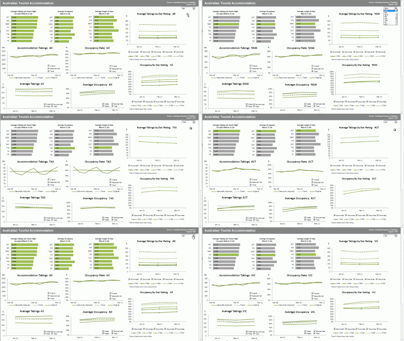
Dashboards are a visual display of your data. They convey the most important information at a glance, and they often enable the user to interact with the report and choose how they view the data, like in this interactive dashboard below:

Excel Dashboard

The principles for building dashboard reports can be applied to almost all of your Excel work.

As you read through the tips I’m about to share keep in mind other areas of your work you could apply these principles to.

How to Build an Excel Dashboard

A dashboard is really just a compilation of charts and data tables that fit on one page. This is something Excel is ideal for and as a result you can create some amazing dashboards without the need for any other programs.

I recommend you keep your raw data, your analysis and your dashboard on separate worksheets so that the flow of data is clear and uncluttered.

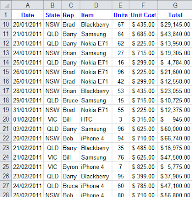
Ensure your data is in a tabular format. That is; there is a separate row for each record. The column labels tell you what type of information is contained within, like this:

Tabular

If your data isn’t in this format it will make your life difficult and create additional unnecessary work. Why?

Because most formulas and tools in Excel are designed to be used with data in a tabular format.

That means if it’s not in a tabular format you possibly won’t be able to use some of the built in tools designed to analyse data quickly.

For example, if you want to use a Pivot Table for analysis then your data must be in a tabular format.

Plus there are loads of formulas that work with data in a tabular format, like these useful functions for building dashboard reports:

SUMIF, SUMIFS and SUMPRODUCT

AVERAGEIF and AVERAGEIFS

COUNTIF, COUNTIFS, COUNT and COUNTA

MIN, MAX, SMALL, LARGE and RANK

Database Functions like DSUM, DCOUNT, DMIN etc.

VLOOKUP, HLOOKUP, INDEX and MATCH

IF, Nested IF’s, IFERROR, OR and AND

OFFSET, INDIRECT and CHOOSE

GETPIVOTDATA

For free tutorials on the above functions go here: Excel Formulas

So, now you’ve got your data in a tabular format, on the Analysis sheet you can set up a table to feed each chart or table that will be on your dashboard.

Excel Dashboard Design Tips

Now, before you get carried away with those 3D pie charts here are a few design rules.

Your mantra should be KISS – Keep It Simple Stupid. That means:

  1. Don’t use 3D effects, gradients, mutli-coloured charts or give each chart in your dashboard a different colour.
  2. Don’t use pie charts unless you are only displaying 2 sets of data. Any more than that and a pie chart is virtually useless. Instead try a column or bar chart.
  3. Let the data do the talking. The less legends, labels, gridlines the better. If you think you need these then maybe your chart is trying to do too much. Remember it should be quick for the reader to interpret. If they have to read every label and refer to legends then it’s not quick.

Let’s take the two charts below as examples. Both charts display the same information. The first chart is cluttered with ‘chart junk’; bevelled edges, redundant Y axis labels, dark colours etc. The linear trend line isn’t aiding interpretation since we automatically do this without even realising just by looking at the column heights, likewise the grid lines.

If we remove the trend line we can also get rid of the legend since the chart title tells us what the data is.

Now look at the second chart. It’s clean, the data does the talking and we get the key information without any distractions. The bottom line is it’s quicker to interpret, and that’s the goal.

Charts

Making Your Dashboard Interactive

We can build interactivity into our dashboards with an Excel Drop Down List a.k.a. Data Validation List.

We then link our formulas to the output of the drop down list.

For example, let’s say we have our regions we want the report to toggle through. We’ll set up our drop down list in cell A2:

Dropdown


Then on our analysis worksheet we have a SUMIF formula that sums all of the data for the chosen region.

So using the example data here from our Raw Data worksheet:

Tabular

Our formula would be:

=SUMIF(‘Raw Data’!B2:B50, ‘Analysis’!A2‘Raw Data’!G2:G50)

In English the formula above reads:

Where the State in column B of the Raw Data sheet is the same as the State selected from the drop down list on the Dashboard sheetsum the data in column G on the Raw Data sheet.

Rinse and repeat for other tables in your analysis sheet so they all link to the drop down list.

And like magic before your eyes your dashboard report will dynamically update upon selection in the drop down list like this:

Dashboard 2


Animated Charts

Animation isn’t always for every chart or table in your report but in some instances animating the data in your chart will help users recognise patterns in the data that might otherwise be difficult to see.

For example animation of how data moves over time is often helpful, but not always.

Animated Chart

It requires VBA to control the animation. We then link formulas to the output of the VBA, similarly to how we did for a drop down list.

If VBA isn’t one of your strengths you can learn how to animate charts in Mynda Treacy’s hugely popular Excel dashboard course.

About the Author

Mynda Treacy


Mynda Treacy is co-founder of My Online Training Hub, author of their comprehensive Excel Formulas list, and popular Excel Blog.

She started using Excel in 1995 and has been teaching and writing about Excel since 2010.

If you would like to learn from her you can. She shares her knowledge in her Advanced Excel course and periodically she also opens her Excel Dashboard course.


SPECIAL OFFER:

Just until the end of July, Mynda has offered Not Just Numbers readers a great deal on her Excel Dashboard course.

Receive 20% off Mynda’s Excel Dashboard course (if you sign up by 31st July).

And, as an extra incentive for Not Just Numbers readers to take advantage of this offer (as if learning Excel Dashboards and getting 20% wasn’t enough) I will also send you my Introduction to Pivot Tables Course absolutely free of charge.

So, do it now while it’s fresh in your head. If you don’t, you know you’ll not remember again until the offer’s gone!

Click here to get the Excel Dashboard course with 20% off, as well as your free copy of An Introduction to Pivot Tables.

Excel Dashboard Reports

If you enjoyed this post, go to the top of the blog, where you can subscribe for regular updates and get your free report “The 5 Excel features that you NEED to know”.


Excel Tip: Rounding Numbers

Rounded ZeroFrom the Not Just Numbers blog:

Anyone who works with numbers for a living knows all too well the perils of rounding errors.

One of the positive aspects of Excel is that, by default, it doesn’t round numbers. It stores (and uses) the full number, even if it is only displaying, say, two decimal places.

This is great for ensuring that calculations are accurate, but can lead to some apparent oddities when adding up calculated figures.

You can run the risk of displaying, say, three figures with a total and the total appears not to add up. This is because the numbers are displayed to, say, two decimal places, despite the fact that the numbers underneath might have four or five.The complete numbers do add up, but the displayed numbers don’t.

This is where you need to know how to round in Excel.

Excel offers three rounding functions (ROUND, ROUNDDOWN and ROUNDUP) which all work in a similar way.

The ROUND function has the following syntax:

=ROUND(Number,number of decimal places)

This rounds “Number” to the number of decimal places specified using the rule I was taught at school – round down up to 4 and round up 5 and above. The number of decimal places can be negative to allow you to round to the nearest ten (-1), hundred (-2), etc.

The other two rounding functions work in exactly the same way, except ROUNDDOWN always rounds down and ROUNDUP always rounds up.

One other point to mention is the Excel setting (in Options -> Advanced) to “Set precision as displayed”. This calculates formulae based upon the displayed number of decimal places, throughout the whole workbook. In my opinion, this is a very dangerous way to address the issue. Just imagine the damage if you format a section of a worksheet to display as a whole number – not realising that there is a percentage within that range that is used in calculations. Any percentage below 50% would be evaluated as zero, and any above 50% as 100%. Far better that any rounding used in the spreadsheet is done deliberately, using the functions above.

Why not treat yourself and take a look at our Excel Expert Advanced Excel Training?

If you enjoyed this post, go to the top of the blog, where you can subscribe for regular updates and get your free report “The 5 Excel features that you NEED to know”.

Excel Tip: Calculating elapsed time between British Men’s Wimbledon Champions

Tennis KingFrom the Not Just Numbers blog:

I hope all of my readers in the UK are enjoying our current heatwave.

The focus here in the UK for weeks now has been whether Andy Murray could finally win the Wimbledon Men’s Singles title, 77 years after the last Brit (Fred Perry) won it on 3rd July 1936. A feat Murray achieved magnificently on Sunday (7th July 2013) – well done Andy.

In a blatant attempt to be topical, I thought I would explain this week, how to calculate the elapsed time between two dates in Excel.

NB: To avoid any confusion, all dates are shown using the format most commonly used in the UK, i.e. dd/mm/yyyy.

Dates in Excel are stored as numbers, starting with 1 being 1/1/1900, 2 being 2/1/1900, etc.

The date of Sunday’s final (7/7/2013) is stored in Excel as 41,462. You can see this by typing the date in Excel and changing the number format back to General.

[I don’t intend to cover times in this post, but it is worth noting that where 1 is a whole day, decimals mark the time in that day. Technically 41,462 is midnight on the morning of the 7/7/2013 – 41,462.5 would be 12 noon on that day.]

Given that the date is held in Excel as a number (representing the number of days since 1/1/1900), then if cell A1 holds the date of Fred Perry’s Wimbledon win (3/7/1936) and A2 holds the date of Andy Murray’s win (7/7/2013), to calculate the elapsed number of days between the two we simply need to subtract one from the other, so the following formula would work:

=A2-A1

…the answer being 28,128 days.

In many applications this is what is required, e.g. days an invoice has been outstanding, however in this example years might be a more appropriate unit of measure. We can do this in one of two ways, which are subtly different:

We can deduct the year of the first date from the year of the second date, using the YEAR function to pull out the year:

=YEAR(A2)-YEAR(A1)

…returning 77, i.e. 2013-1936

This is probably the most appropriate approach for our purposes as Wimbledon is an annual competition, and we would not be concerned with the timing during the year.

An alternative approach would be to use the DATEDIF function which can calculate the total COMPLETE years that have elapsed between the two dates.

DATEDIF has the following Syntax:

=DATEDIF(Start date,End date,Interval)

where Interval, can be “d” (complete days), “m” (complete months) or “y” (complete years).

Interval can also be “ym”, “yd” or “md” being complete months excluding years, complete days excluding years, or complete days excluding months (and years) respectively.

In our example we simply need:

=DATEDIF(A1,A2,”y”)

…this also returns 77, however as this measures COMPLETE years, the answer would have been 76 if this year’s final had been, say, 1st July. This is the reason that, for our example, I would recommend the previous approach.

Here’s to hoping that the gap until the next British champion is more appropriately measured in days!

Click here for our our exclusive offer on Online Excel Training

If you enjoyed this post, go to the top of the blog, where you can subscribe for regular updates and get your free report “The 5 Excel features that you NEED to know”.

Excel Tip: Multiple rows of text in one cell

Multiple rows of text

From the Not Just Numbers blog:

Just a quick post this week.

Excel is great at handling numbers and text data fields, but what about when you need to wax lyrical and enter and hold larger sections of text.

In the data behind an invoice spreadsheet, for example, we might want to be able to enter significantly more text in the description column than anywhere else.

There are a couple of little tips worth knowing when entering larger chunks of text like this, and I thought I’d share these with you.

First of all, it’s worth knowing how much text you can enter in one cell. Excel is restricted to 32,767 in a cell, which should be more than you need for most practical purposes. So how do we make the most of this?

Wrap text
The first feature worth knowing about is “Wrap text”. This is a tick box accessed on the Alignment Tab when you select Format Cells (accessible (among other ways) by right-clicking on the cell and choosing Format Cells).

When this box is ticked, the text in the cell “wraps” similar to a word processor, i.e. when a word will not fit onto a line, it moves onto the next line.

The row height also flexes to fit the multiple rows of text.

Alt + Enter
Less people seem to know about this one (as is usually the case with features that are not selected from a menu). While typing within a cell, pressing Enter will finish editing that cell and move onto the next one. However, pressing Alt+Enter stays in the same cell but moves onto the next line (again like a word processor). This is great for typing a list in one cell, or entering data in paragraphs.

Once again, the row height flexes to fit the multiple rows of text.

That’s it for this week, now you can go off and write a  novel in Excel!

Click here for our our exclusive offer on Online Excel Training

If you enjoyed this post, go to the top of the blog, where you can subscribe for regular updates and get your free report “The 5 Excel features that you NEED to know”.
Excel Tip: Display and use fractions in Excel

Fraction

From the Not Just Numbers blog:

I recently created a spreadsheet for tracking gambling debts for a client who wanted to enter (and display) odds as a fraction.

This required me to come up with a formula to read the fraction so that it could be used in the calculation of the winnings.

This got me to thinking that there will be other scenarios where it is preferable to enter numbers as fractions rather than decimals – and to display them as such.

So I thought I’d share my approach.

The easy bit is to get it to allow the user to type in a fraction and continue to display it as such. Simply change the number format of the input cells to Text, so that when the user types 1/4, that is what is displayed. A general format should also do this but it is better to format exactly what you are after rather than use General and let Excel decide.

The tricky bit is to get Excel to convert this to something it can use in calculations – i.e. a decimal.

The method I used was to use text manipulation formula to split out the components of the fraction.

The functions needed are VALUE, LEFT, RIGHT, LEN and FIND.

RIGHT, LEFT and LEN are all described in an earlier post:

Excel Tip: Manipulating text in Microsoft Excel

so I won’t described them again here.

The two functions not covered in that post are:

VALUE(text) converts a number formatted as text into a number that Excel can then use in calculations. My first attempt was to use this to convert the fraction straight to a decimal number, however it requires the text to be a single number – not a formula. It can, however, be used to convert the numerator and the denominator into numbers.

FIND(text to find,text to search in,optional starting position) returns the position (as a number) of the first instance of the string text to find, in the string text to search in starting at theoptional starting position if specified. e.g. FIND(“D”,”ABCDEFEDCBA”,5) returns 8 as this is the position of the first D it finds from position 5 onward – whereas FIND(“D”,”ABCDEFEDCBA”) returns 4 as it starts looking at the start of the string.

We basically want to return the value of the text before the slash and divide it by the text after the slash, to give us a number we can use. We will assume the fraction is entered in cell A1.

In both cases we will need to find the position of the slash, using =FIND(“/”,A1).

We can return the text before the slash by using the LEFT function:

=LEFT(A1,FIND(“/”,A1)-1)   (without the -1 we would return the slash as well, which we don’t want)

We can then convert this to a value using the VALUE function:

=VALUE(LEFT(A1,FIND(“/”,A1)-1))

We can return the text after the slash by using the RIGHT function, but we will need to use LEN to know where to stop:

The number of characters we will need to return in the RIGHT function, can be calculated as follows:

=LEN(A1)-FIND(“/”,A1)

So the RIGHT function then reads:

=RIGHT(A1,LEN(A1)-FIND(“/”,A1))

We can again use the VALUE function to convert this to a number:

=VALUE(RIGHT(A1,LEN(A1)-FIND(“/”,A1)))

Finally, divide one by the other to convert the whole fraction to a usable number:

=VALUE(LEFT(A1,FIND(“/”,A1)-1))/VALUE(RIGHT(A1,LEN(A1)-FIND(“/”,A1)))

Definitely a good idea to put this into a working cell, so that you don’t need to do this every time you want to use the fraction. All of your formulae can then refer to the calculated cell.

I’m sure some of you will have other approaches which I’d love to hear about in the comments.

Click here for our our exclusive offer on Online Excel Training

If you enjoyed this post, go to the top of the blog, where you can subscribe for regular updates and get your free report “The 5 Excel features that you NEED to know”.
Art, Gaming, Rock and Roll – What do you use Excel for?

Excel Art

From the Not Just Numbers blog:

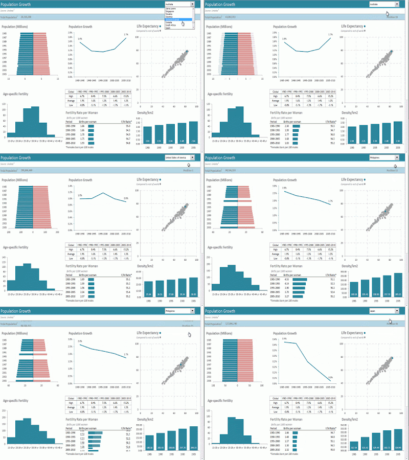
An old friend from school (Yin Maher), shared this picture with me on Facebook – because it was amazingly made using Excel Autoshapes by 73 year-old Japanese artist, Tatsuo Horiuchi.

You can see more of Horiuchi’s work, and even download the spreadsheets at the following link:

Tatsuo Horiuchi | the 73-year old Excel spreadsheet artist

Apart from contemplating on what it says about me that girls from school associate me with spreadsheets – it also got me thinking about other uses of Excel that Microsoft could never have conceived of.

One of the more obscure uses I have seen is the recreation of AC/DC’s Rock and Roll Train video in Excel.

Another use, that stretches the boundaries of Excel is Canadian accountant Cary Walkin’s creation of an entire fantasy video game in Excel.

So, what bizarre uses have you seen Excel put to? I’d love to hear about them in the comments.

Click here for our our exclusive offer on Online Excel Training

If you enjoyed this post, go to the top of the blog, where you can subscribe for regular updates and get your free report “The 5 Excel features that you NEED to know”.

Excel Tip: Freeze panes to make scrolling easier

Freeze PanesFrom the Not Just Numbers blog:

Another simple tip this week. This time to make life easier when scrolling around large spreadsheets.

Many of you may know this, but I regularly see users scrolling around large sheets, lost – or using split windows as a very clunky way to try to achieve the same thing – so clearly, many users don’t.

So if you need to be able to know your heading and row titles wherever you are on a worksheet, read on.

Freeze Panes is accessed from the View ribbon in Excel 2007 onwards, or from the Window menu in earlier versions.

In the later versions, you get three options, Freeze Panes, Freeze Top Row and Freeze First Column. Once I have explained the first one, the second and third options will be pretty obvious (and don’t exist in Excel 2003 and earlier as the same can be achieved easily using the first option).

Selecting Freeze Panes freezes everything above and to the left of the active cell. Meaning that these rows and columns will stay on screen when you scroll down or to the right, no matter how far you go.

For example, if you click in cell B3 and select Freeze Panes, this will freeze (or lock) rows 1 and 2 and column A. This means as you scroll to the right, the first column to disappear from view will be column B, and as you scroll down, the first row to disappear will be row 3.

If you no longer need these panes frozen, you will notice that the option on the menu has now changed to Unfreeze Panes, so just click that to remove the lock.

Simple, but can make life so much easier when a spreadsheet doesn’t fit on your monitor screen.

Click here for our our exclusive offer on Online Excel Training

If you enjoyed this post, go to the top of the blog, where you can subscribe for regular updates and get your free report “The 5 Excel features that you NEED to know”.

Excel Tip: A quick way to add dollar signs in a formula

Quick dollar signs

From the Not Just Numbers blog:

Last week, I posted a really simple tip for copying down a formula to the bottom of your data.

This turned out to be one of my most popular posts, registering over 2,000 page views in under a week.

I said in that post:

I’ve lost count of the amount of times I’ve used this in front of an experienced Excel user who has stopped me and said “What did you just do there?”.

Given its popularity, I thought I would post another simple tip that has regularly elicited that same response.

Coincidentally, this also relates to my most popular post ever (written two years ago, it still drew over 5,000 page views last month!), The dollar sign ($) in a formula – Fixing cell references.

If you don’t know why you would want to add dollar signs to a formula, then I would recommend reading that post. If you do, read on for a simple, but often missed, tip for adding them quickly.

When entering a reference in a formula, there are four possible ways in which you can apply the dollar signs:

1. Fix both the column and the row, e.g. =$A$1

2. Fix just the row, e.g. =A$1

3. Fix just the columns, e,g. =$A1

4. Fix neither the column, nor the row, e.g. =A1

This can be quite fiddly, typing the dollars in the right place, particularly if you have entered the reference by clicking the cell and then need to click the cursor in the right place to enter the dollar sign(s).

This is where this simple tip comes in.

As long as the cursor is in the reference, or immediately before or after it, you can use the function key F4, to toggle through the options above (in the order shown).

That’s it, pressing F4 once adds both dollars, twice fixes the row, three times fixes the column, four times removes the dollars again. If you got over-excited and missed the right one, you can keep cycling through the options until you hit it again.

Simple, I know – but again, only if you already know it!

Click here for our our exclusive offer on Online Excel Training

If you enjoyed this post, go to the top of the blog, where you can subscribe for regular updates and get your free report “The 5 Excel features that you NEED to know”.


Excel Tip: A really quick way to copy down a formula

Fill down formulaFrom the Not Just Numbers blog:

Just a quick tip this week, as it was a Bank Holiday yesterday in the UK, and I now have four days to fit a week’s work in!

This is a really simple one, but I’ve lost count of the amount of times I’ve used this in front of an experienced Excel user who has stopped me and said “What did you just do there?”.

Like all simple things, it’s only simple if you know it!

This is a really easy tip in Excel to copy a formula down to the bottom of your data – without scrolling.

There are many times – particularly if you lay out your data as per my advice in earlier posts – that you wish to copy a formula down to the bottom of your data. If you have thousands of rows of data this can be a tedious and time consuming task, as you scroll down page after page.

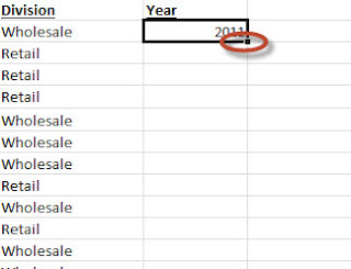
But it doesn’t have to be like that. Simply select the cell that you want to copy down and double-click on the black square at the bottom right of your selected cell (as highlighted in the image above).

If the rest of this column is empty, it will copy the contents down to the bottom of the data in the column adjacent to it.

If you already have a formula copied all of the way down, and you edit the top one, this will copy it to the bottom of this column (overwriting the older version of the formula).

That’s it for this week. Simple, but really handy if you didn’t already know about it.

Click here for our our exclusive offer on Online Excel Training

If you enjoyed this post, go to the top of the blog, where you can subscribe for regular updates and get your free report “The 5 Excel features that you NEED to know”.