 From the Not Just Numbers blog:
We often use Excel to analyse data from elsewhere. This might be from another Excel spreadsheet, or a text file exported from another software tool – maybe your accounts package.
We all know that Excel is brilliant at this, but the job can be made significantly more difficult when the data we want to analyse is not in the best format for us to work with.
Earlier this year, I wrote a post on tidying up text in Excel. This can help sort out the format of individual fields to get them the way you want them, but what if the layout of the data itself not what you require.
If you are not sure how you want your data laid out to make it easy to analyse, this post might help.
One frustrating layout issue is when you are presented with data that is in rows where columns would be more useful, or vice versa – fortunately Excel has a simple solution.
Say we have some data that we want to paste into our spreadsheet as follows:
This data would be easier to analyse if we had one column per field, i.e. two columns of data rather than two rows.
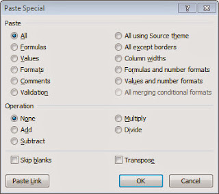
All we have to do is copy the data as normal but, when we paste it into our spreadsheet, click Paste Special, or Ctrl-Alt-V and we are presented with the following dialog box which allows us to make various changes to the data as we paste it (I will look at some of the others in future posts).
In this case we want to tick the Transpose box. This flips the data round, switching rows for columns.
When we then click OK, our pasted data looks like this:
Exactly as we wanted it.
If you enjoyed this post, go to the top of the blog, where you can subscribe for regular updates and get two freebies “The 5 Excel features that you NEED to know” and “30 Chants for Better Charts”.


