From the Not Just Numbers blog:
We’ve got a bit of a change this week, with a guest post from the Queen of Dashboards, Mynda Treacy (of My Online Training Hub).
This is a hot topic for Excel users, as the ability to create dynamic dashboards is increasingly becoming a requirement of employers.
Mynda’s article provides some great information on the subject, but if you scroll down, you can take advantage of a brilliant offer on her excellent Excel Dashboards training course (but only if you act quickly). I really would recommend it.
Excel Dashboard Reports
Guest post by Mynda Treacy of My Online Training Hub
There’s a new craze around town and it’s called Excel Dashboard reports. Actually it’s not that new but it’s becoming a standard for reporting, and as a result it’s a must have skill for any Excel user who prepares reports.
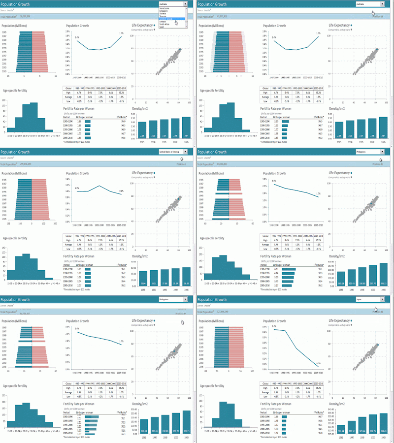
Dashboards are a visual display of your data. They convey the most important information at a glance, and they often enable the user to interact with the report and choose how they view the data, like in this interactive dashboard below:
The principles for building dashboard reports can be applied to almost all of your Excel work.
As you read through the tips I’m about to share keep in mind other areas of your work you could apply these principles to.
How to Build an Excel Dashboard
A dashboard is really just a compilation of charts and data tables that fit on one page. This is something Excel is ideal for and as a result you can create some amazing dashboards without the need for any other programs.
I recommend you keep your raw data, your analysis and your dashboard on separate worksheets so that the flow of data is clear and uncluttered.
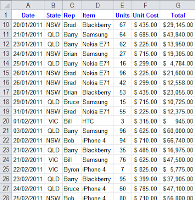
Ensure your data is in a tabular format. That is; there is a separate row for each record. The column labels tell you what type of information is contained within, like this:
If your data isn’t in this format it will make your life difficult and create additional unnecessary work. Why?
Because most formulas and tools in Excel are designed to be used with data in a tabular format.
That means if it’s not in a tabular format you possibly won’t be able to use some of the built in tools designed to analyse data quickly.
For example, if you want to use a Pivot Table for analysis then your data must be in a tabular format.
Plus there are loads of formulas that work with data in a tabular format, like these useful functions for building dashboard reports:
SUMIF, SUMIFS and SUMPRODUCT
AVERAGEIF and AVERAGEIFS
COUNTIF, COUNTIFS, COUNT and COUNTA
MIN, MAX, SMALL, LARGE and RANK
Database Functions like DSUM, DCOUNT, DMIN etc.
VLOOKUP, HLOOKUP, INDEX and MATCH
IF, Nested IF’s, IFERROR, OR and AND
OFFSET, INDIRECT and CHOOSE
GETPIVOTDATA
For free tutorials on the above functions go here: Excel Formulas
So, now you’ve got your data in a tabular format, on the Analysis sheet you can set up a table to feed each chart or table that will be on your dashboard.
Excel Dashboard Design Tips
Now, before you get carried away with those 3D pie charts here are a few design rules.
Your mantra should be KISS – Keep It Simple Stupid. That means:
- Don’t use 3D effects, gradients, mutli-coloured charts or give each chart in your dashboard a different colour.
- Don’t use pie charts unless you are only displaying 2 sets of data. Any more than that and a pie chart is virtually useless. Instead try a column or bar chart.
- Let the data do the talking. The less legends, labels, gridlines the better. If you think you need these then maybe your chart is trying to do too much. Remember it should be quick for the reader to interpret. If they have to read every label and refer to legends then it’s not quick.
Let’s take the two charts below as examples. Both charts display the same information. The first chart is cluttered with ‘chart junk’; bevelled edges, redundant Y axis labels, dark colours etc. The linear trend line isn’t aiding interpretation since we automatically do this without even realising just by looking at the column heights, likewise the grid lines.
If we remove the trend line we can also get rid of the legend since the chart title tells us what the data is.
Now look at the second chart. It’s clean, the data does the talking and we get the key information without any distractions. The bottom line is it’s quicker to interpret, and that’s the goal.
Making Your Dashboard Interactive
We can build interactivity into our dashboards with an Excel Drop Down List a.k.a. Data Validation List.
We then link our formulas to the output of the drop down list.
For example, let’s say we have our regions we want the report to toggle through. We’ll set up our drop down list in cell A2:
Then on our analysis worksheet we have a SUMIF formula that sums all of the data for the chosen region.
So using the example data here from our Raw Data worksheet:
Our formula would be:
=SUMIF(‘Raw Data’!B2:B50, ‘Analysis’!A2, ‘Raw Data’!G2:G50)
In English the formula above reads:
Where the State in column B of the Raw Data sheet is the same as the State selected from the drop down list on the Dashboard sheet, sum the data in column G on the Raw Data sheet.
Rinse and repeat for other tables in your analysis sheet so they all link to the drop down list.
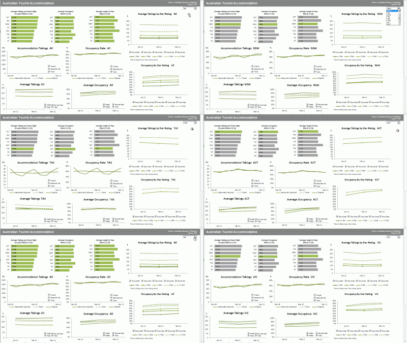
And like magic before your eyes your dashboard report will dynamically update upon selection in the drop down list like this:
Animated Charts
Animation isn’t always for every chart or table in your report but in some instances animating the data in your chart will help users recognise patterns in the data that might otherwise be difficult to see.
For example animation of how data moves over time is often helpful, but not always.
It requires VBA to control the animation. We then link formulas to the output of the VBA, similarly to how we did for a drop down list.
If VBA isn’t one of your strengths you can learn how to animate charts in Mynda Treacy’s hugely popular Excel dashboard course.
About the Author
Mynda Treacy is co-founder of My Online Training Hub, author of their comprehensive Excel Formulas list, and popular Excel Blog.
She started using Excel in 1995 and has been teaching and writing about Excel since 2010.
If you would like to learn from her you can. She shares her knowledge in her Advanced Excel course and periodically she also opens her Excel Dashboard course.
SPECIAL OFFER:
Just until the end of July, Mynda has offered Not Just Numbers readers a great deal on her Excel Dashboard course.
Receive 20% off Mynda’s Excel Dashboard course (if you sign up by 31st July).
And, as an extra incentive for Not Just Numbers readers to take advantage of this offer (as if learning Excel Dashboards and getting 20% wasn’t enough) I will also send you my Introduction to Pivot Tables Course absolutely free of charge.
So, do it now while it’s fresh in your head. If you don’t, you know you’ll not remember again until the offer’s gone!
If you enjoyed this post, go to the top of the blog, where you can subscribe for regular updates and get your free report “The 5 Excel features that you NEED to know”.


