 From the Not Just Numbers blog:
In my previous post, I stated that one of the major problems with how most Excel users lay out their data, is using a column for each category.
In the feedback I have had from that post, it was felt that this point needed further explanation and/or an example, so I thought I would provide both here.
First of all, here is the point as it appeared in the original post (it was point number 3):
Don’t group data by putting it in different columns (THIS IS THE ONE THAT ALMOST EVERYONE GETS WRONG)
-
- Don’t split out financial or numerical data into separate columns to categorise the data into months, expense categories, customers, agents, etc.
- Do have one column for the financial or numerical data and create a column for month, expense category, customer or agent, to categorise each row;
- You can use data validation drop-down lists to select the appropriate category for each row;
- This one is counter-intuitive because in any report, you will almost certainly will want a column (or row) for each of these categories – but if you do this in the data you will massively restrict what you can do with it.
Let’s look at some sales data laid out the wrong way:
I have left out any extra data (other than the date) to keep it simple. With the data laid out like this, you could use the SUM function to calculate monthly totals, but you can’t do a lot more than that. If you were to use the data in a pivot table, you would have to add the data as 12 data fields, making it very cumbersome and inflexible.
Also, if you wanted to do any calculations on this data, such as calculating VAT, or any other Sales Tax for that matter, you would need another 12 calculated columns!
You then get into further problems if you want to analyse the data from another perspective – by salesperson for example.
A better approach
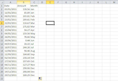
Now let’s see a better way to lay this data out:
You can also automate the month column using the following formula in cell C2:
=CHOOSE(MONTH($A2),”Jan”,”Feb”,”Mar”,”Apr”,”May”,”Jun”,”Jul”,”Aug”,”Sep”,”Oct”,”Nov”,”Dec”)
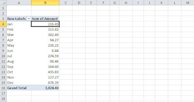
Laid out like this you can use the month as a way of analysing the amount in a pivot table for example:
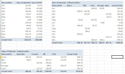
Its real power however comes when you wish to add additional analysis and calculations, so for example you could add additional analysis columns for Salesperson and Country, and a VAT column (being 20% of amount):
You can then produce all manner of pivot tables, here are just a few examples:
It would be just as easy to show the months as columns – the only reason I haven’t is to make best use of the space.
And remember, you can at any stage easily add further analysis or calculation columns as your reporting needs change.
I hope this has explained this point in more detail and even more importantly, highlighted the value of getting it right!


